Digital Storm Tshirt ConceptPost Date: 2008-06-24 |
Post Reply 
|
| Author | |
!ender_ 
DS Veteran 
Joined: 24 Oct 2007 Online Status: Offline Posts: 4219 |
 Quote Reply Quote Reply
 Topic: Digital Storm Tshirt Concept Topic: Digital Storm Tshirt ConceptPosted: 24 Jun 2008 at 1:47am |
|
Obviously its not a polished product, its a drawing board, just for fun, let me know what you think: likes/dislikes/requests (my least favorite part is the text being so clean but every time i masked it, it looked very forced and wierd)
update:
updated to remove the zipper and offset the red some more to the bottom left
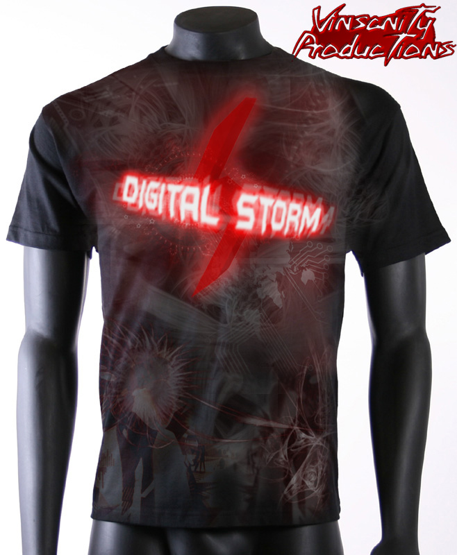 Edited by !ender_ - 25 Jun 2008 at 12:49am |
|
 |
|
|
Alex
Admin Group 
Digital Storm Supervisor 
Joined: 04 Jun 2012 Online Status: Offline Posts: 16314 |
Quote Reply
Posted: 24 Jun 2008 at 2:09am |
|
Wow nice man. I think we might have to hire you as one of our designers. Regards,
Alex
|
|
|
|
|
!ender_
DS Veteran
Joined: 24 Oct 2007 Online Status: Offline Posts: 4219 |
Quote Reply
Posted: 24 Jun 2008 at 2:44am |
|
where do i sign

|
|
|
|
|
!ender_
DS Veteran
Joined: 24 Oct 2007 Online Status: Offline Posts: 4219 |
Quote Reply
Posted: 24 Jun 2008 at 11:00pm |
|
bump no other opinions or just too many hot topics tonight?
i was expecting some more, do this and dont do this from such a picky community
of course there is harley, can alway count on that... maybe ill make a harley t if i dont get sidetracked tonight
 |
|
|
|
|
skyR
Newbie 
Digital Storm Apprentice
Joined: 08 Oct 2007 Online Status: Offline Posts: 2220 |
Quote Reply
Posted: 24 Jun 2008 at 11:11pm |
|
you don't want my opinion.. trust me =x
|
|
|
|
|
|
|
|
!ender_
DS Veteran
Joined: 24 Oct 2007 Online Status: Offline Posts: 4219 |
Quote Reply
Posted: 24 Jun 2008 at 11:29pm |
|
woot, now im even happier with it, thanks!
even better, post yours! Edited by !ender_ - 24 Jun 2008 at 11:33pm |
|
|
|
|
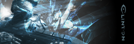
Clinton
Groupie 

Joined: 08 Sep 2007 Online Status: Offline Posts: 298 |
Quote Reply
Posted: 24 Jun 2008 at 11:41pm |
|
I don't like the zig-zag design down the right side of the shirt. Other than that, it looks pretty good.
|
|
|
|
|
|
|
!ender_
DS Veteran
Joined: 24 Oct 2007 Online Status: Offline Posts: 4219 |
Quote Reply
Posted: 25 Jun 2008 at 12:29am |
|
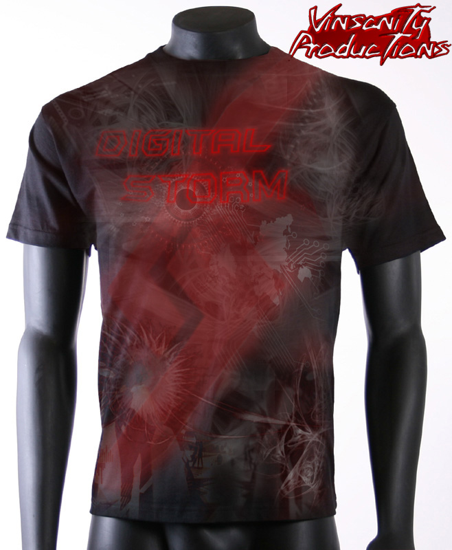
yea the more i look at it i agree with you clinton
updated Edited by !ender_ - 25 Jun 2008 at 12:49am |
|
|
|
|
Tyler Lowe
Newbie
Joined: 14 May 2008 Online Status: Offline Posts: 0 |
Quote Reply
Posted: 25 Jun 2008 at 1:19am |
|
I would:
Increase the size of the current DSO logo and use it as a wrap around graphic, and tone down the red, and place a smaller clear logo over the left breast.
|
|
|
|
|
!ender_
DS Veteran
Joined: 24 Oct 2007 Online Status: Offline Posts: 4219 |
Quote Reply
Posted: 25 Jun 2008 at 1:46am |
|
something like? couldnt really find a place for a second, smaller logo, making the wrap bigger loses its lines, making it smaller stabs the neckline... see what you think
 |
|
|
|
|
Tyler Lowe
Newbie
Joined: 14 May 2008 Online Status: Offline Posts: 0 |
Quote Reply
Posted: 25 Jun 2008 at 2:03am |
|
I think I would try different placements of the lightning bolt logo, and see how it goes. Up, down, more to the left or right, etc., but yes, that is basically what I had in mind. You might ditch the large "Digital Storm" and try the wrap with just the bolt, and then try a smaller "Digital Storm" text as well. I'm just tossing out some ideas here, it's hard to see what sorts of effects are possible without actually watching the program being used to manipulate the images in person. It's your design though. What do *you* think of this sort of direction? |
|
|
|
|
!ender_
DS Veteran
Joined: 24 Oct 2007 Online Status: Offline Posts: 4219 |
Quote Reply
Posted: 25 Jun 2008 at 2:25am |
|
well not so much my design as a spitballing endeavor, i know what id like to see but its always beneficial to get outside opinions. ive never attempted to paint/design a piece of clothing before. I am, however, very interested in style marketing, where things should go in commercials, on posters, etc. my idea behind some sort of big letters is that the shirt can be just as much advertising as it is trendy, making the shirts cheaper for us as DSO would have us wearing them out to more than just lans/nvision, etc. any project i do in vegas, photoshop or 3ds max is the product of 3+ tries, that each give something to the finished piece. i think ill definatly have to do a front/back to encompass any sort of wrap, but i defiantly like the bigger logo, it takes away the cheezy-ness of the first look, with the logo/letters flaring with red and white... reminds me of some sort of old cleaning product: lol
 Edited by !ender_ - 25 Jun 2008 at 2:27am |
|
|
|
|
Sarah
Newbie
Hardcore Gamer Joined: 07 Jun 2008 Online Status: Offline Posts: 879 |
Quote Reply
Posted: 04 Jul 2008 at 3:18am |
|
I know this is a few days late in reply. But thats not a bad design at all. I would certainly wear it out in public if I had a shirt like that.
|
|
|
|
|
Kliebor2
Senior Member 
Joined: 22 May 2008 Online Status: Offline Posts: 659 |
Quote Reply
Posted: 04 Jul 2008 at 7:18am |
|
Yes Ender, definitely cool, you are talented in the digital art medium that is for sure.
I like the second one alot. Dave |
|
|
Digital Storm 950Si - Q9450 Quad Core @ 3 Ghz
Dual PNY OC2 GTX 560Ti 8 Gigabytes DDR2/800 2 Western Digital 500 GB SATAII 7200 RPM HD |
|
|
|
|
Post Reply
|
| Forum Jump | Forum Permissions You cannot post new topics in this forum You cannot reply to topics in this forum You cannot delete your posts in this forum You cannot edit your posts in this forum You cannot create polls in this forum You can vote in polls in this forum |
About Digital Storm
Contact Information
Facility Tour
Financing
Buy Now, Pay Later
Downloads
GSA Schedule
Terms & Conditions
Privacy Policy
Request Help
Call: 1-866-817-8676
(Hours 9AM-5PM PST)
![]()
![]()
![]()
![]()
![]()


 Topic Options